Behind the design
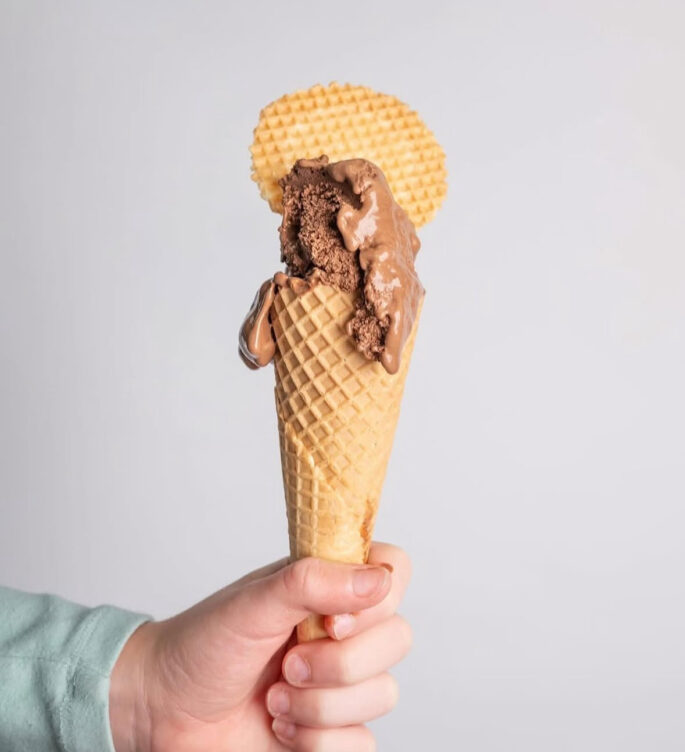
When two flavour masters—Simon Gault and Little Lato—teamed up to create the ultimate gelato, they needed packaging that looked just as good as the product tastes. My role was to design tubs that felt as joyful, bold, and irresistible as opening the lid for that first scoop.
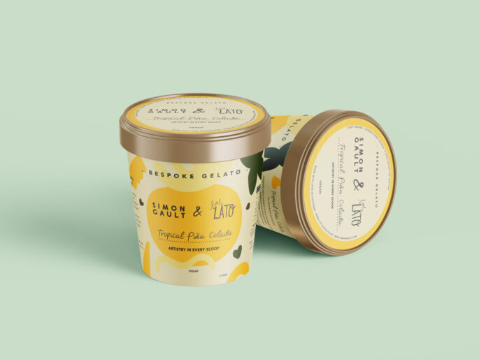
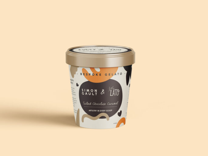
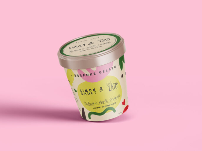
We went for a vibrant colour palette that instantly catches the eye and sets the mood for something fun and indulgent. Each of the three flavours has its own unique colour story and personality, making them easy to recognise while sitting beautifully together as a collection.
To add a playful edge, I incorporated hand-drawn shapes and elements that bring movement and energy to the design. These details make the tubs feel approachable and full of character—because gelato shouldn’t just taste good, it should look like happiness in a tub.
The result? Packaging that not only ticks every box on the brief, but also tells the story of collaboration, creativity, and pure delight—one scoop at a time.